

Most brand marketers have a library of product footage and not enough clarity on what actually makes a video sell. Choosing the wrong format wastes budget and leaves performance on the table. The examples of winning product videos you'll find here are not curated for aesthetics. They are studied for results. Each one represents a different approach to direct-response storytelling, the industry term for video content engineered specifically to trigger viewer action. You'll walk away with a concrete framework, real-world breakdowns, and a comparison table you can use to match the right style to your brand's goals.
Table of Contents
- Key Takeaways
- What defines examples of winning product videos
- 1. The $1.6M pants ad built on disciplined restraint
- 2. The $5.9M toothpaste ad that weaponized curiosity
- 3. Interactive product demos that turn viewers into buyers
- 4. Minimalist luxury showcases that sell through sensation
- 5. Comparison table: which video style fits your brand
- My take on what actually makes product videos convert
- How Surgingmedia builds product videos that actually sell
- FAQ
Key Takeaways
| Point | Details |
|---|---|
| Proof timing drives conversions | Place your strongest evidence just before the CTA to remove doubt exactly when it peaks. |
| Short formats can scale massively | Videos under 60 seconds have generated millions in ad spend when built on specific claims and visual proof. |
| Interactivity lifts signup rates | Interactive demos consistently reach 20% demo-to-signup conversions and cut sales call time significantly. |
| Sensory visuals create desire | Texture-focused, minimalist footage triggers prestige perception and works especially well on Instagram Reels. |
| Restraint outperforms polish | Disciplined, sales-mapped visuals convert better than artistically ambitious production with no clear argument. |
What defines examples of winning product videos
Not every product video that looks impressive actually sells. The ones that do share a specific architecture. Understanding that structure is what separates a brand marketer who guesses from one who builds with intention.
Here is what the best-performing product videos consistently get right:
- Video length matched to purpose. Ideal product video lengths range from 30 to 45 seconds for teasers and under 3 minutes for deeper explainers. Choosing the wrong length for your platform kills retention before the message lands.
- Proprietary mechanism naming. Generic claims like "super comfortable" fade instantly. Naming a specific mechanism, such as "AirMax fabric" or a clinical compound, creates perceived uniqueness that no competitor can simply copy.
- Layered proof types. The strongest videos stack visual demonstrations, third-party data, and social proof in sequence. Each layer dismantles a different viewer objection.
- Strategic CTA placement. Compelling proof placed just before the call to action removes friction exactly when purchase anxiety is highest.
- Persuasion over production. Every shot must serve the sales argument. Close-ups, text overlays, and evidence timing all carry narrative weight.
- Platform-specific tailoring. A video built for Amazon product pages does not behave the same way as one built for TikTok. Format, pacing, and sound design all shift with the platform.
Pro Tip: Before you script a single frame, write down the three objections your buyer is most likely to raise. Then map each one to a specific moment in the video. If you can't do that, the concept isn't ready.
1. The $1.6M pants ad built on disciplined restraint
This is one of the clearest successful product video examples in direct-response advertising. A 41-second ad for a pair of pants generated $1.6 million in attributed ad spend, not because of stunning cinematography, but because every visual mapped to a sales argument.
The video centers on a single proprietary mechanism: AirMax fabric. That naming choice matters. It transforms a vague comfort claim into something tangible, specific, and ownable. Viewers see steam passing through the fabric and watch the elastic waistband stretch without distortion. These are not stylistic choices. They are visual proof of a stated claim.
What the video does particularly well:
- Opens with distinction, not description. The first seconds show what makes this pant different, not what it is.
- Avoids competitor comparisons entirely. The narrative stays focused on the product's world, which keeps messaging clean and legally safe.
- Places a 45-day return guarantee right before the CTA. That risk-removal moment is placed precisely where doubt peaks, not at the beginning where it gets forgotten.
- Uses close-up texture shots. Fabric detail footage is not decorative. It reinforces the AirMax claim with visual credibility.
The lesson here is restraint. There is no lifestyle montage, no celebrity, no music swell. The video commits completely to one mechanism and proves it three different ways before asking for the sale.
2. The $5.9M toothpaste ad that weaponized curiosity
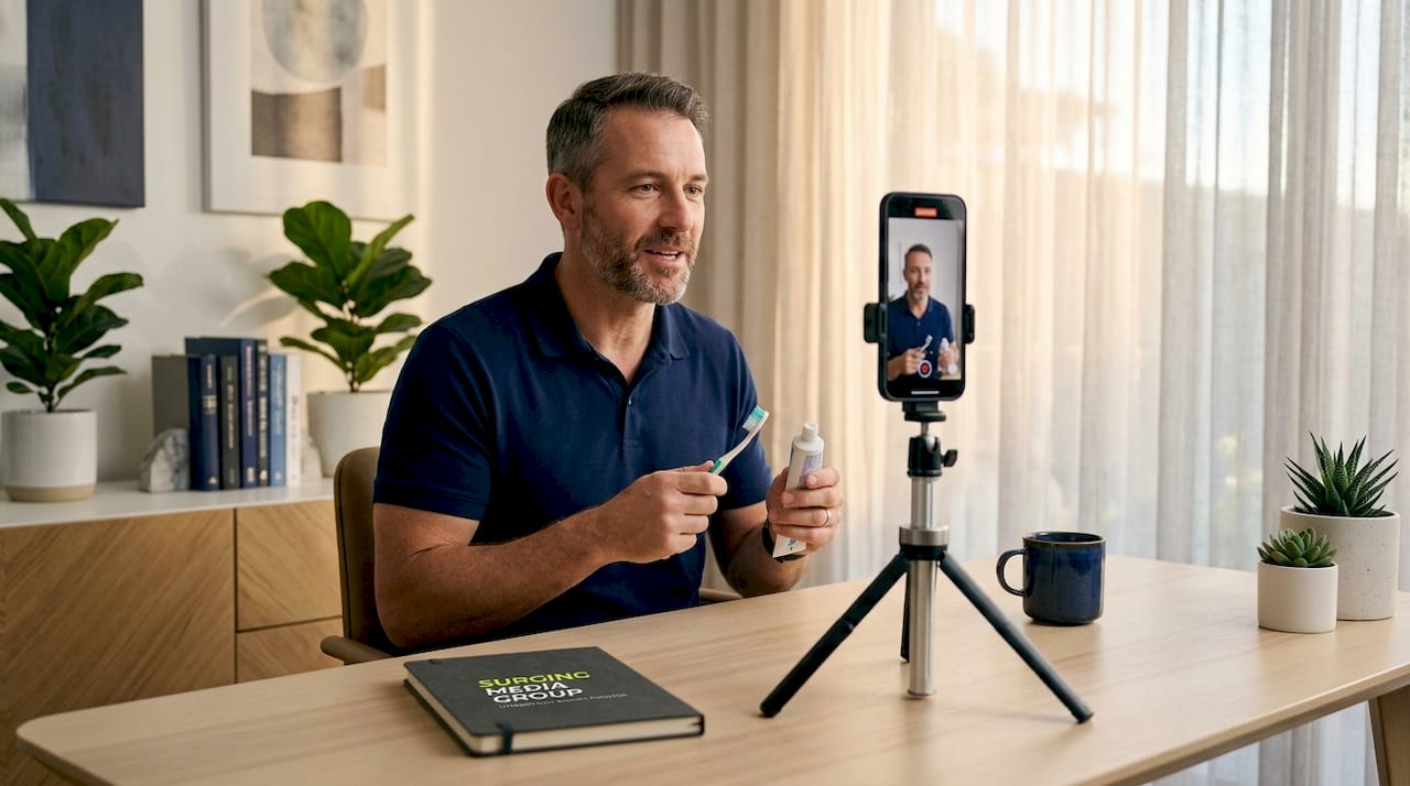
If you study best product video samples across the health and wellness space, this 58-second toothpaste ad stands apart. It spent $5.9 million in total, with $3.6 million of that in a single 30-day window. The format is deceptively simple: a person in a car, talking directly to the camera.
The video opens with a mystery question that repositions the product as insider knowledge, something the mainstream dental industry has not told you. That framing immediately activates curiosity and separates the viewer from the generic toothpaste category. What follows is a layered evidence stack:
- Clinical data delivered conversationally, not as a slide
- Excerpts from third-party articles shown briefly on screen
- A 3D model illustrating the product's mechanism at the molecular level
- Direct address to the viewer that simulates a trusted friend sharing a discovery
The friendly, one-on-one delivery is doing heavy lifting here. It bypasses the skepticism viewers bring to traditional ads because it does not feel like an ad at all. That tone shift is calculated, not accidental.
Then, at the 50-second mark, the strongest proof lands: a satisfaction guarantee paired with clinical data summary. By the time the CTA appears, the viewer's three most common objections, "Does it work?", "Can I trust this?", and "What if I waste my money?", have all been answered. The result is a video that converts because it removes friction systematically, not because it entertained its way to a click.
3. Interactive product demos that turn viewers into buyers
Static video has limits. Once the playback ends, the viewer walks away. Interactive demos keep them inside the product experience, and the conversion data is hard to ignore.
Here is how the numbers break down across real implementations:
| Metric | Result |
|---|---|
| Demo-to-signup conversion rate | 20% |
| Free-to-paid user lift | 50% |
| Reduction in demo creation time | 80% |
| Product launch video view rate | 93% |
| Website engagement gain | 15% |
These figures come from interactive demo platforms that have documented results across B2B SaaS, ecommerce, and digital services. The formats vary widely: guided walkthroughs, sandbox environments, onboarding tours, and click-through feature showcases. What they share is that the viewer controls the pace. That shift in agency dramatically increases completion rates.
Brands like Ahrefs use interactive demos to educate potential customers on tool functionality before a sales conversation ever happens. The result is a shorter sales cycle and higher-quality inbound leads. Meanwhile, demo creation workflows have become faster by up to 80%, which matters when you need to refresh content for product updates or seasonal campaigns.
Pro Tip: For SaaS and complex physical products alike, build a 90-second "guided tour" version of your interactive demo for paid social, and link it to the full interactive experience on your landing page. The video creates desire; the demo closes the gap.
4. Minimalist luxury showcases that sell through sensation
Some products do not need an argument. They need a feeling. High-end minimalist product showcase videos operate on a different psychology than direct-response ads. The goal is not to convince. It is to create desire so visceral that reasoning becomes secondary.
The Golden Concept phone case video is a textbook example. The footage focuses entirely on texture: suede grain, chrome edge catches, the weight suggested by slow camera movement. There is no voiceover explaining features. There is no price anchor, no guarantee, no CTA until the final frame. The video trusts the material to speak.
This approach works because of specific production choices:
- Soft, directional lighting that reveals texture rather than flattening it
- Macro lens work that brings viewers physically close to the material surface
- Loopable structure designed for Instagram Reels autoplay behavior
- ASMR-adjacent audio such as the subtle sound of suede brushing against a surface
Luxury product showcases also use minimalist sensory footage to signal premium positioning without saying a word. The absence of features-and-benefits language is itself a signal. It says: "This product does not need to justify itself to you."
The practical note for marketers is platform alignment. This format performs on Instagram Reels and Pinterest, where visual scroll-stopping is the primary goal. It underperforms on YouTube pre-roll or Connected TV, where viewers expect a narrative arc and a clear reason to act.
5. Comparison table: which video style fits your brand
| Video Style | Best Platform | Ideal Product Type | Proof Approach | Production Complexity |
|---|---|---|---|---|
| Direct-response short-form | Meta, TikTok | Apparel, supplements | Proprietary mechanism + guarantee | Low to medium |
| Science-curiosity narrative | YouTube, Meta | Health, wellness, CPG | Clinical data + third-party endorsement | Low (UGC-style) |
| Interactive demo | Website, B2B email | SaaS, complex products | Hands-on experience + guided walkthrough | Medium to high |
| Minimalist luxury showcase | Instagram, Pinterest | Accessories, premium goods | Sensory material footage | Medium |
| Product launch explainer | YouTube, Amazon | New product categories | Feature demonstration + social proof | Medium to high |
My take on what actually makes product videos convert
I've watched hundreds of product video campaigns across categories, and the pattern that stands out is not what most marketers expect. The videos that generate serious sales almost never win on production value alone. They win on argument architecture.
The most common mistake I see is spending 80% of the budget on cinematography and 20% on the actual sales logic. That ratio should often be inverted, especially in direct-response contexts. A disciplined visual sales argument built around a specific mechanism claim, with proof timed to match viewer psychology, will outperform a beautifully shot video that has no clear structure.
What I've also learned: brands consistently underestimate the importance of objection sequencing. Viewers raise doubts in a predictable order. "Does this work?" comes before "Can I trust this brand?" which comes before "Is it worth the price?" Your video needs to answer those in that order, not scatter proof points randomly across the runtime.
My honest advice to any video producer reading this: resist the pull toward artistic aspiration when the goal is sales. There is real craft in restraint. The strongest evidence placed strategically before your CTA is not a creative compromise. It's the whole game.
— Sergio
How Surgingmedia builds product videos that actually sell
At Surgingmedia, we build product videos around one question: what does a viewer need to believe before they buy? That framing shapes everything from scripting to the timing of proof points to the platform your finished video is deployed on. Whether you need a direct-response video for a product launch, an Amazon listing, a social media reel, or a CTV campaign, the work we do is grounded in the same direct-response principles you've seen analyzed throughout this article. We have produced performance-driven content for brands like Copper Compression and Black & Decker, and we work with brands nationwide. If you want to learn more about types of video ads that are performing in 2026, that is a strong place to start.
FAQ
What length works best for a product video ad?
Video length should match platform and purpose: 30 to 45 seconds for social teasers and under 3 minutes for detailed explainers. Shorter formats retain attention better when the opening 5 seconds are built around a specific, arresting claim.
Where should I place the call to action in a product video?
Place your CTA immediately after your strongest proof point, whether that is a guarantee, clinical data, or a visual demonstration. Proof placed just before the CTA reduces purchase anxiety at the exact moment it peaks.
Do interactive product demos outperform standard videos?
For SaaS and complex products, yes. Interactive demos drive 20% demo-to-signup conversions and can lift free-to-paid users by 50%, significantly outperforming passive video in categories where hands-on understanding drives the purchase decision.
What makes a product video feel credible without a big budget?
Specific, measurable claims built around a proprietary mechanism create credibility more effectively than expensive production. Close-ups that visually prove a stated claim, third-party endorsements shown briefly on screen, and a conversational delivery tone all build trust without requiring a large crew.
Which video style works best for luxury or premium products?
Minimalist showcase videos that use texture, soft lighting, and macro footage perform best for premium goods. Sensory-focused footage signals prestige through what it leaves out, and the loopable format is purpose-built for Instagram Reels autoplay behavior.